
Menu
Menu
The Importance of Responsive Web Design in Today’s Mobile-First World

techmero.in
Introduction
The importance of responsive web design cannot be overstated in today’s digital landscape, where mobile devices dominate internet usage. With more than half of global web traffic coming from smartphones and tablets, businesses must ensure their websites are mobile-friendly to provide a seamless user experience. A website that adapts to different screen sizes enhances user engagement, improves search rankings, and boosts conversions. In this article, we will explore why responsive web design is essential in a mobile-first world.
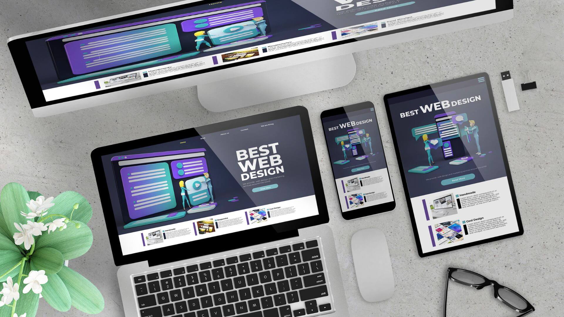
What is Responsive Web Design?
Responsive web design (RWD) is a web development approach that enables websites to adjust dynamically based on the user’s device. Instead of creating separate designs for desktops, tablets, and smartphones, RWD uses flexible grids, fluid images, and CSS media queries to ensure optimal display across all screen sizes.
Key Features of Responsive Web Design:
Fluid Grid Layouts – Content is arranged in a proportional grid rather than fixed pixels.
Flexible Images – Images resize automatically to fit different screen resolutions.
CSS Media Queries – Adjusts styling and layout based on device screen size.
By implementing responsive web design, businesses can provide a consistent and high-quality user experience across all devices.
Why Responsive Web Design is Essential for SEO
One of the key reasons businesses should prioritize responsive web design is its impact on search engine rankings. Google, the leading search engine, considers mobile-friendliness as a ranking factor, meaning that websites that are not responsive may lose visibility in search results.
How Responsive Web Design Affects SEO:
Improved User Experience – A mobile-friendly site reduces bounce rates and increases time spent on the page.
Faster Page Load Speed – Responsive design optimizes loading times, which is a critical factor for search rankings.
Eliminates Duplicate Content Issues – Managing a single URL structure prevents SEO issues caused by multiple versions of a site.
With mobile-first indexing in place, Google primarily evaluates a website’s mobile version, making the importance of responsive web design more significant than ever for SEO success.
Enhancing User Experience with Responsive Web Design
A seamless and intuitive user experience (UX) is crucial for retaining visitors and converting them into customers. Responsive web design enhances UX by ensuring accessibility, readability, and ease of navigation across all devices.
Benefits of a Responsive UX:
Consistent Navigation – A uniform layout across devices makes it easier for users to find what they need.
Touchscreen-Friendly Elements – Buttons and menus are designed for effortless tapping and scrolling.
Better Readability – Text scales appropriately, eliminating the need for zooming or horizontal scrolling.
When users encounter a well-designed responsive website, they are more likely to engage with the content and take desired actions, such as making a purchase or signing up for a newsletter.
Increased Conversion Rates with Mobile Optimization
Businesses that invest in responsive web design often see higher conversion rates, as users are more likely to complete transactions on a site that functions smoothly across all devices. Mobile responsiveness directly influences customer trust, engagement, and purchasing behavior.
How Responsive Web Design Boosts Conversions:
Reduced Friction in the Checkout Process – Easy navigation and quick load times encourage users to complete purchases.
Enhanced Credibility – A professional-looking, mobile-friendly site builds trust and encourages user engagement.
Adaptability to Mobile Payment Methods – Many users prefer digital wallets and mobile payment options, which function best on responsive sites.
By making the buying journey smooth and hassle-free, businesses can maximize their online sales potential.
Comparison of Responsive vs. Non-Responsive Websites
The following table highlights the differences between responsive and non-responsive websites:
| Feature | Responsive Web Design | Non-Responsive Web Design |
|---|---|---|
| User Experience | Seamless across devices | Poor on smaller screens |
| SEO Benefits | Ranks higher in search engines | Lower rankings due to poor mobile usability |
| Loading Speed | Optimized for quick loading | Slower on mobile devices |
| Maintenance | Easy to manage (one website) | Requires multiple versions |
| Conversion Rates | Higher due to better UX | Lower due to navigation issues |
As seen above, the advantages of responsive web design far outweigh the limitations of a non-responsive website
Future Trends in Responsive Web Design
With technological advancements and changing user behaviors, responsive web design continues to evolve. Here are some emerging trends that will shape the future of web design:
Key Trends to Watch:
Progressive Web Apps (PWAs) – Combining the best of web and mobile apps for an enhanced user experience.
Dark Mode and Adaptive Themes – Allowing users to switch between light and dark modes for comfort.
Voice Search Optimization – Ensuring that responsive sites are optimized for voice search queries.
AI-Powered Personalization – Delivering customized content based on user behavior and preferences.
By staying ahead of these trends, businesses can continue to provide exceptional user experiences and maintain competitive advantages.
Conclusion
The importance of responsive web design is undeniable in today’s mobile-first world. With more users accessing websites from mobile devices, businesses must prioritize responsiveness to improve SEO rankings, enhance user experience, and boost conversion rates. A well-optimized, mobile-friendly site ensures accessibility, engagement, and long-term success. Investing in responsive web design is not just an option—it is a necessity for businesses aiming to thrive in the digital age. Ensure your website is responsive today to stay ahead of the competition!
Share
Published: April 2, 2025
Do You Enjoyed This Article?
Join our community of 3 million people and get updated every week We have a lot more just for you! Lets join us now
- No charge
- Unsubscribe anytime
Recent Post